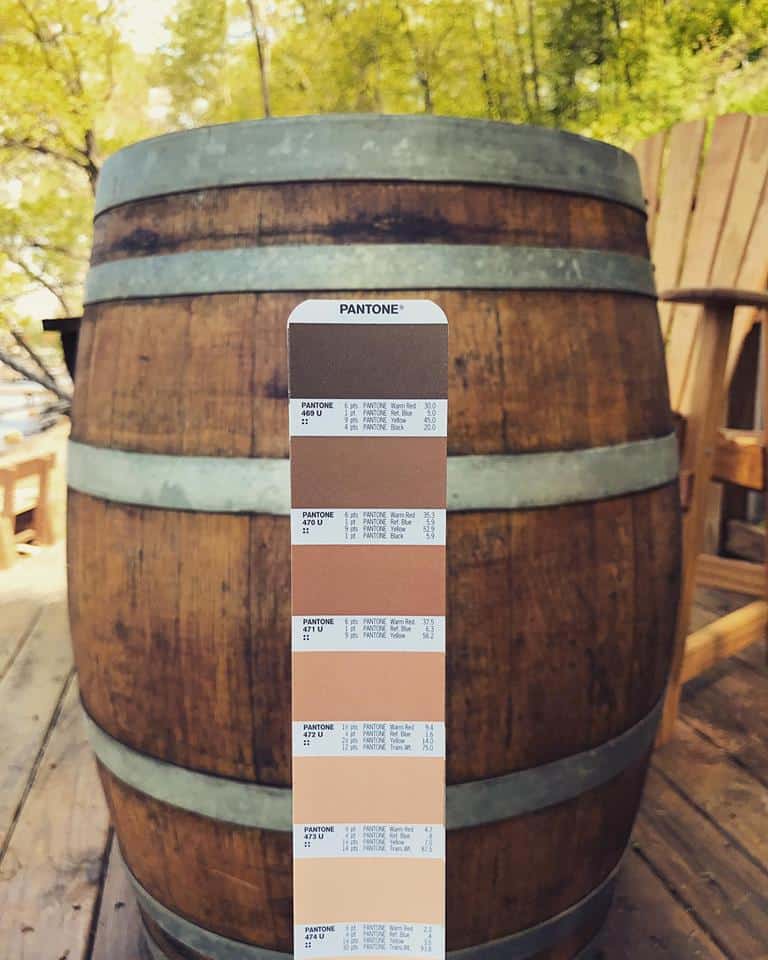
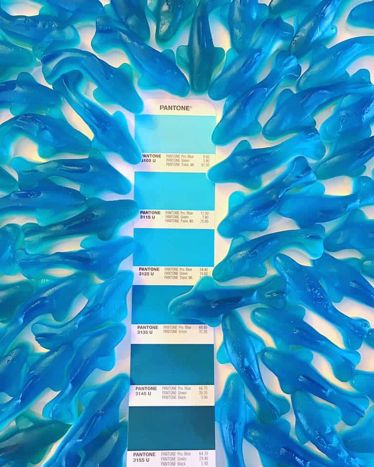
 Corcoran Printing #MatchColorMonday can help when looking for color ideas for your next print project. #MatchColorMonday can be found on Corcoran Printing’s Facebook and Instagram pages. Every Monday, the commercial full color and foil print team showcase a different pantone color palette. Photos are taken of the palette paired with an item that matches. Finally these colorful photos are meant to spur the design imagination.
Thousands log on to Corcoran Printing’s social media sites each week to see what creative pantone concept the print team has come up with. Corcoran Printing #MatchColorMonday has tied in national brands from General Mills and Kellogg’s cereals to Blue Diamond almonds and Skittles candy. This fresh approach to showcasing color also incorporates seasonality and current events. Follow Corcoran Printing on social media and you won’t be disappointed. You may view a sea of gummy sharks swimming among a palette of Pantone ocean blue one week. A bright summer field of wildflowers highlighting Pantone shades of yellow may spark your print imagination the next week.
This clever concept is sure to provide many ideas for your next printed postcard or brochure. Corcoran Printing #MatchColorMonday always features various shades of a certain color. Print experts also inform as to the best ways to achieve color harmony. You will get paper stock ideas, as well as foil stamp and emboss ideas. Corcoran Printing provides examples of just how easy it is to find a Pantone color to complement a photo or graphic. The goal is to create a unique look for design of a print piece that will grab attention.
Selecting a Pantone Color
Designers will quickly and easily find a particular color on the Pantone website. Simply type in a color, such as aqua, peach or pink. You will then scroll through many different shades of that color. For ease of navigating, the PMS or Pantone colors are even divided among ideas for graphic designers, fashion and interior designers, and industrial designers.
Find the most recent Pantone Color Report and also the color of the year, along with color pairing ideas. In addition, the site also has many informational articles on the use of and selection of colors. The site pairs well with the creative ideas of Corcoran Printing #MatchColorMonday. With both, you will be well on your way to selecting the right colors to make your next printed marketing piece pop.
The Use of Color in Design and Print
Color is often used to create a particular mood. Different colors can have an impact on customers. Careful attention should always be given to colors used in logos, printed postcards and printed brochures. Finally, here are some examples of how your customers may be affected by the use of the use  of various colors .
- Red is often used to convey a feeling of strength, excitement and importance.
- Orange gives the feel of a casual energy and a bit of fun.
- Yellow brings a mood of happiness and friendliness.
- Green is of course the color of nature. It has an environmentally friendly look and peaceful feel.
- Blue is often used to suggest trustworthiness, dependability and security. Blue is a color used by many brands.
- Black can set many moods. It is frequently used to sympbolize luxury and sophistication when advertising certain products.
 See Corcoran Printing #MatchColorMonday for great color ideas!
Be sure to follow Corcoran Printing on Instagram to see the #MatchColorMonday ideas every week. You can also like Corcoran Printing on Facebook for more color print and specialty foil ideas. Corcoran Printing is the printer of choice for many national brands, as well as local and regional businesses. Call a Corcoran Printing color and print expert today at 800.564.0085.
Recent Comments