When it comes to brand recognition, your logo is probably the first thing that your customers will remember. Color has a great effect on a person’s emotion, and research suggests that your logo colors will have a great impact on your customers’ opinion of your company and it’s products. It will also help to differentiate you from the competition.
 According to an article in Entrepreneur Magazine, color can become a key part of any brand. The theory of the Interactive Effects of Colors shows that the relationship between brands and colors hinge on the perceived perception of how the color fits the product or brand being sold.
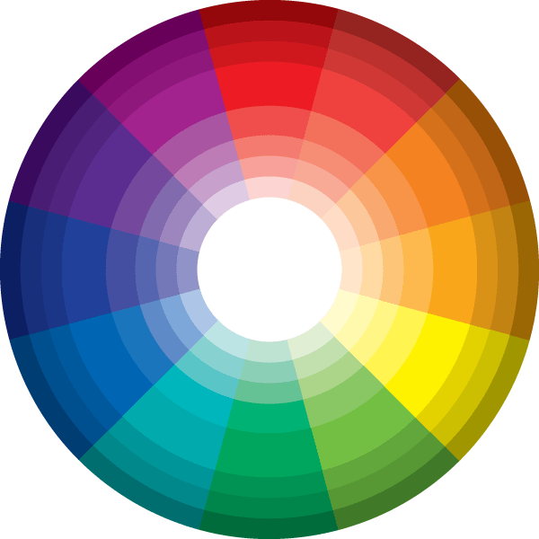
Here are the feelings evoked by various colors and brands that use those colors in their logos:
Red – Love, energy, intensity – Red evokes strong emotions and even encourages appetite. Red creates a sense of urgency and is used to attract impulsive shoppers. It also evokes feelings of expertise. You’ve seen many food and drink logos in red, including Kellogg’s, McDonald’s, Nabisco, KFC, Heinz and Coca Cola. Also powerful news outlets, including CNN and Time.
Yellow – Joy, intellect, attention – Yellow increases cheerfulness and warmth and encourages communications. It’s used to grab attention. Famous yellow logos, include the golden arches of McDonald’s, Yellow Pages, Best Buy, and Sprint.
Green – Freshness, safety, growth – Green is often associated with nature, health, good luck and jealousy. It represents new grow the and is used as a color in stores to create a sense of relaxation. Famous brands, including Holiday Inn, Whole Foods, Starbucks, Tropicana, Animal Planet and John Deere all use green in their logo.
Blue – Stability, trust, serenity – Blue stimulates feeling of confidence, security, order and cleanliness. It is associated with peace and creates a sense of security and trust in a brand. Blue logos you might know are Dell, IBM, HP, GE, Facebook, Ford, Gillette and American Express.
 Purple – Royalty, wealth, wisdom. Purple is often used to soothe and calm, and can represent a creative, imaginative brand. We see purple on logos including, Hallmark, YAHOO!, Welch’s, Wonka, Cadbury, Syfy and Crown Royal.
Orange – Energy, warmth, excitement – Orange creates a call to action, such as buy, sell or subscribe. It represents a friendly, cheerful brand. Those brands that have incorporated orange into their logo include Hooters, Nickelodeon, Gulf, Home Depot, Food Network, Harley Davidson and Amazon.
According to Inc. Magazine, if you’re branding is blue, you’re in good company. More of the world’s top 100 brands use blue in their logo than any other. No matter what color you choose, remember that your logo shade is going to convey a subtle message to your customers.
A famous study on the topic of color and emotions is Joe Hallock’s “Colour Assignments.” His data found some notable preferences in certain colors across gender. For instance, both men and women overwhelmingly list blue as their favorite color. Both men and women strongly dislike brown and orange. Men also seem to dislike purple, but women like it.
Understanding how a color can affect a person’s emotions can help you select the proper colors to represent your brand and increase your effectiveness in the marketplace.
To learn more about how Corcoran Printing can help you better represent your brand with our wide array of products and services, call 800-564-0085.
Recent Comments