In a world where jewelry lines are plentiful, your display cards do more than showcase product, they embody brand craftsmanship. When thoughtfully designed, these cards elevate a piece from ‘nice’ to ‘noticeable’.
This article dives into smart layout tactics, creative die-cut shapes, logo placement finesse, and tactile enhancements that can help your display cards attract and retain attention. It also highlights Corcoran Printing’s strengths in bringing these design choices to life.


1. Leading Layouts That Capture Attention
When customers first glance at a display card, their eyes usually travel in an “F” or “Z” pattern, starting at the top left, sweeping across, then moving down. Placing your most important elements, logo, product name, or focal graphic within this natural reading path ensures they’re seen.
Pro tip: Keep the front of the card clean and centered. A minimalist layout with ample white (or branded) space lets your jewelry shine, without distraction.
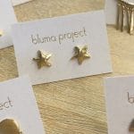
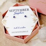
2. Die-Cut Shapes That Reflect Your Style
Ditch the rectangle and experiment with custom cuts that align with your brand personality:
- Arched tops evoke classic elegance. Perfect for fine jewelry lines.
- Geometric silhouettes (diamonds, hexagons) convey modern, edgy brands.
- Product-themed shapes (leaf, wave, scallop) can subtly mirror design inspiration or collection motifs.
Shape plays a critical role in retail settings. A uniquely shaped card in a rack draws the eye over uniform rectangles.
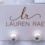
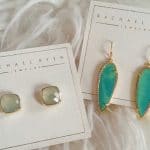
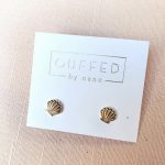
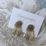
3. Strategic Logo Placement for Immediate Connection
The logo is your signature, it should be unmistakable but not overpowering. Key options include:
- Top-center placement: Posts branding immediately.
- Back-of-card logo shadow: Keeps the front clean while reinforcing identity subtly.
- Embossed logo near jewelry: Creates context and a tactile hierarchy, anchoring attention where it matters.
Fine alignment and positioning ensure your logo ties your product to your brand in just a moment.
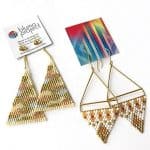
4. Tactile Enhancements that Invite Interaction
Subtle textures can make a big difference. Try these on your next display card:
- Foil accents (gold, silver, or colored) for metallic shine.
- Embossed borders or logos to engage touch and sight.
- Soft-touch coatings lending a velvety feel that feels premium and refined.
- Spot UV elements to highlight graphics that catch glances subtly.
When people touch packaging, they remember it. These finishes also enhance perceived value and spark curiosity.
5. Corcoran Printing’s Production Expertise
Design vision needs production accuracy. Corcoran Printing delivers on both fronts:
- Precision die-cut tooling for consistent, custom shapes.
- Spot-on foil and emboss registration using Heidelberg presses.
- Tactile finish layering that blends foil, emboss, and soft-touch for visual and sensory impact.
- Seamless design-to-print workflows, including die-line setup and bleed management.
Our team collaborates closely with jewelers, from indie designers to established brands, ensuring every card embodies the intended aesthetic and brand promise.
Final Thought: Cards That Speak Volumes
Great jewelry deserves great packaging. Design choices like layout, shape, textures, and branding don’t just decorate, they communicate quality, reinforce identity, and elevate product experience.
Explore how Corcoran Printing can help your display cards stand out with unmatched craftsmanship and care. Let’s turn subtle details into memorable brand moments.
Check Out Some of Our Recent Custom Printed Jewelry Display Cards!


Recent Comments